THE LATEST TECH WORKFORCE TRENDS. RIGHT HERE.
What’s trending now? We help you keep up. As the top name in tech training, we partner with top business leaders and other experts to stay ahead of what’s next – and help you stay up to speed.
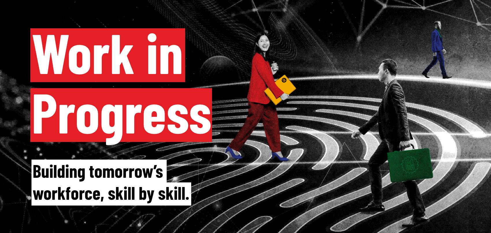
WORK IN PROGRESS
We brought together experts from across industries to unpack how AI is rewriting the rules of work, learning, and leadership.
LATEST POSTS

Article
Nov 20, 2025
Top 5 tech skills to learn before 2025 ends

Article
Nov 19, 2025
General Assembly shares workforce transformation insights at Sitecore Symposium

Article
Nov 18, 2025
Workforce AI training: What works (and what doesn’t)

Article
Nov 16, 2025
Don’t just learn AI. Become AI Native: Introducing our new AI Native Bootcamps in Singapore

Article
Nov 12, 2025
Why learn data analytics? Because it runs, well… everything
Article
Nov 11, 2025
Is a Data Science Career a Good Fit for You? Here’s What You Need to Know.

Article
Nov 10, 2025
Stop making resolutions that fade. Start investing in skills that last.

Article
Nov 10, 2025
Your playbook for building an AI-ready workforce
Let’s Connect
Whether you’re an employer looking to level up your tech team or a learner here to transform your career, we’re ready to help. Give us your info — and we’ll get in touch.