Data visualization is a form of visual communication where data is presented in a pictorial or graphical format. By presenting complex data sets in a visual way, people can comprehend and analyze the information set faster and more clearly.
Why is data visualization important?
Think about an enormous spreadsheet filled with infinite rows and columns of rich, thoughtful, and painstakingly collected data points. Now imagine having to explain and summarize all that information in a way that is understandable and digestible for others. Enter, data visualization. Through graphical or pictorial representation of information, people can easily make sense of enormous amounts of data very quickly, making trends and patterns readily identifiable.
You see data visualizations everywhere these days, particularly in the news. When topical stories are accompanied by great visuals they can help enhance, strengthen, and shed a deeper light on a complex story.
So why are you still reading? This is all about the visual! Let’s dive into some of the best topical data visualization of the year (so far).
Track National Unemployment, Job Gains and Job Losses – Wall Street Journal
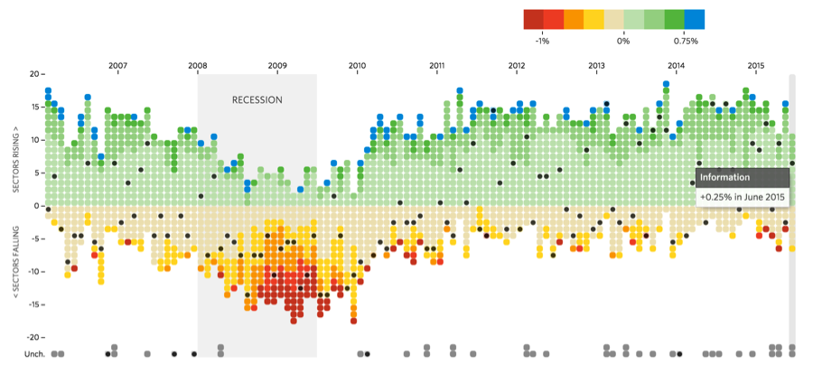
The Wall Street Journal created a data visualization of national unemployment by career sector. This visualization incorporates interactivity and each small dot on the graph above can be hovered on with a mouse to reveal which career sector it represents and the specific gain or loss percentage for the particular month and year. The graph is a great example of how we can get a snapshot of data from a quick glance but upon further exploration, more robust information is revealed.
Gay Marriage State By State – New York Times
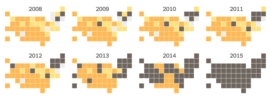
When gay marriage was legalized nationwide in June 2015 the New York Times decided to show rather than tell when publishing this article. They used data visualization to graphically depict state’s stances on gay marriage over the years and created both a set of static images and a video compellation of the data. The static images allow the reader to dig deeply into the information while the video compellation provides a beautifully illustrated and easily consumable overview.
The Impact of Vaccines – The Wall Street Journal
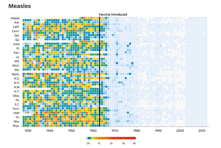
A measles outbreak occurred earlier this year and reopened the national debate on vaccinations. The Wall Street Journal created a series of interactive data visualizations, which included one for measles, to illustrate the number of people infected over a 70-year span in each of the fifty states. This visual is effective because of its jarring impact from the very first glance.
Guide to the Worst Corporate Hack Attacks – Bloomberg
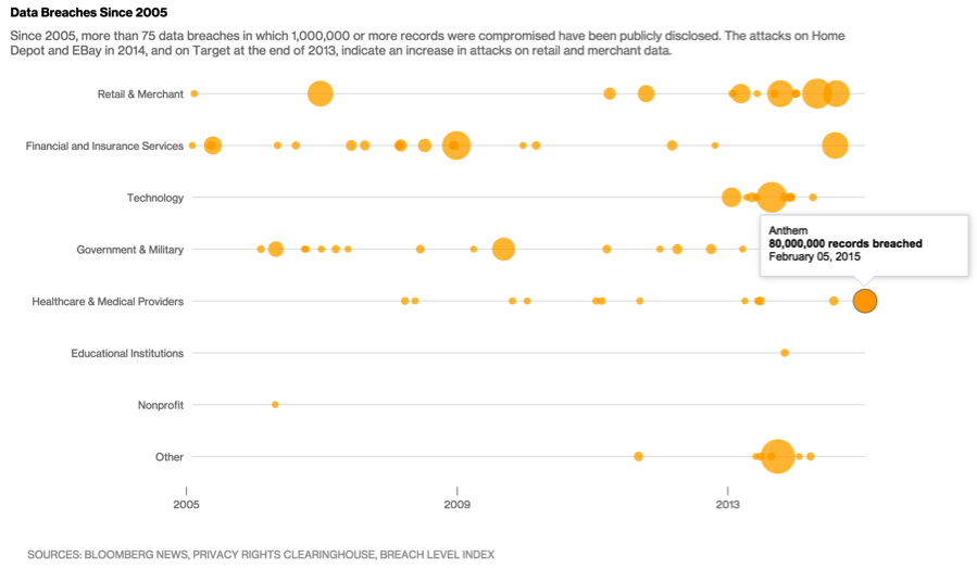
Bloomberg took a longitudinal approach to the visualization of corporate cyber attacks over time, and by sector, representing the worst attacks with larger dots. A viewer can quickly read and understand that attacks are happening more frequently and on larger amounts of records in the most recent years. The trend is well depicted and easy to digest. As an added bonus, scroll over each dot to reveal detailed information about the specific company, date, and affected records.
How the Drought Has Affected California’s Water Usage – New York Times
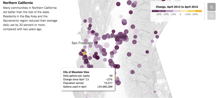
In the middle of a severe drought, California is working to reduce water usage and consumption. The New York Times created an interactive map that represents the changes over the last two years from city by city. When you hover over each dot, more information is revealed about that specific area and how its water usage has changed, for better or for worse, in a variety of categories.
Most Googled Republican Candidate By City – Google News Lab
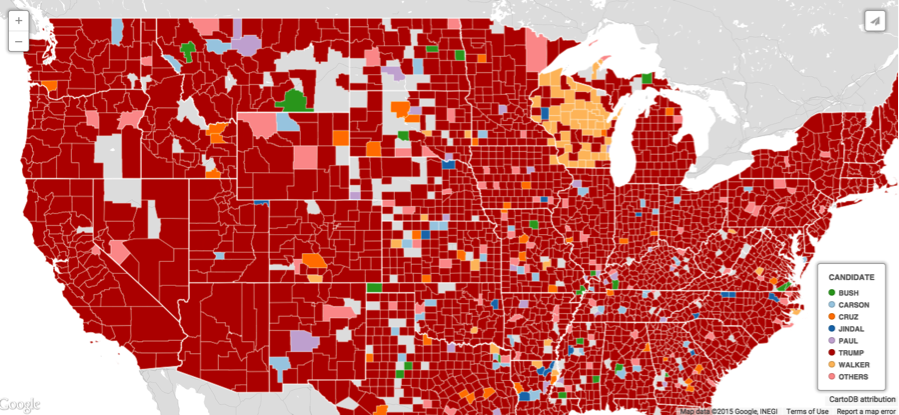
It’s only 2015 but the 2016 presidential race is already dominating the headlines, particularly the crowded field of GOP candidates. Google News Lab created an interactive map to demonstrate America’s current fascination with presidential candidate, Donald Trump.
People Pressing Play on the Same Spotify Song at the Same Time – Spotify
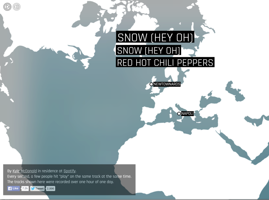
Streaming music service, Spotify, has been in the news lately for feuds with Taylor Swift and competition with Apple Music. While the company sure has grabbed its fair share of headlines, I want to leave you on a lighter note with this data visualization video by Kyle McDonald. He uses a data visualization video to demonstrate the popularity and range of Spotify by showing not only where across the world people are listening to music but also which songs people in different countries happen to press play on at the same time.
Data helps media companies tackle their biggest challenges and explore their biggest opportunities. Media is an area of interest for professionals of almost every background — and it’s one that career changers will feel passionate about pursuing. No matter your interests, you’ll find an opportunity to stay engaged and drive improvements to your employer’s bottom line.
This post is part of our Plot Points content series. See how data affects almost every facet of our culture—from innovation and technology to social impact—and share your own data stories.
