THE LATEST TECH WORKFORCE TRENDS. RIGHT HERE.
What’s trending now? We help you keep up. As the top name in tech training, we partner with top business leaders and other experts to stay ahead of what’s next – and help you stay up to speed.
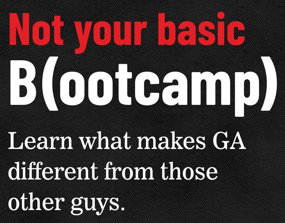
NOT YOUR BASIC BOOTCAMP
At General Assembly, we’re not just another tech bootcamp. We’re the pioneers, the trailblazers, and the innovators of the tech education landscape.
LATEST POSTS

Article
March 3, 2022
Job Change or Career Change? 5 Questions to Help You Figure Out What’s Next

Article
February 13, 2022
Done with your toxic boss? How and when to call it quits.
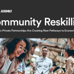
Article
January 25, 2022
Just Launched: The Community Reskilling White Paper

Article
October 28, 2021
Free Friday Online Courses at General Assembly: Your First Step Toward a New Career Is on Us.
Article
September 16, 2021
Alumni Success Stories: How Learning by Doing Led to His Own Design Studio
Article
August 9, 2021
