Designing a Dashboard in Tableau for Business Intelligence
General Assembly
January 21, 2021
Tableau is a data visualization platform that focuses on business intelligence. It has become very popular in recent years because of its flexibility and beauty. Clients love the way Tableau presents data and how easy it makes performing analyses. It is one of my favorite analytical tools to work with.
A simple way to define a Tableau dashboard is as a glance view of a company’s key performance indicators, or KPIs. There are different kinds of dashboards available — it all depends on the business questions being asked and the end-user. Is this for an operational team (like one at a distribution center) that needs to see the number of orders by hour and if sales goals are achieved? Or, is this for a CEO who would like to measure the productivity of different departments and products against forecast? The first case will require the data to be updated every 10 minutes, almost in real-time. The second doesn’t require the same cadence, and once a day will be enough to track the company performance.
Over the past few years, I’ve built many dashboards for different types of users, including department heads, business analysts, and directors, and helped many mid-level managers with data analysis. If you are looking for Tableau dashboard examples, you have come to the right place. Here are some best practices for creating Tableau dashboards I’ve learned throughout my career.
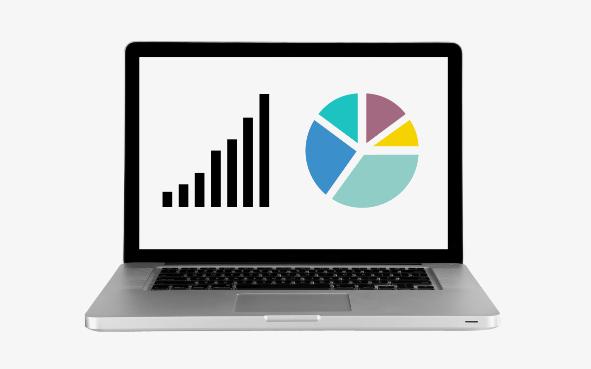
Why Use a Data Visualization?
A data visualizations tool is one of the most effective ways to analyze data from any business process (sales, returns, purchase orders, warehouse operation, customer shopping behavior, etc.).
Below we have a grid report and bar chart that contain the same data source information. Which is easier to interpret?
Grid report vs. bar chart.
That’s right — it’s quicker to identify the category with the lowest sales, Tops, using the chart.
Many companies previously used grid reports to operate and make decisions, and many departments still do today, especially in retail. I once went to a trading meeting on a Monday morning where team members printed pages of Excel reports with rows and rows of sales and stock data by product and took them to a meeting room with a ruler and a highlighter to analyze sales trends. Some of these reports took at least two hours to prepare and required combining data from different data sources with VLOOKUPs — a function that allows users to search through columns in Excel. After the meeting, they threw the papers away (a waste of paper and ink), and then the following Monday it all started again.
Wouldn’t it be better to have an effective dashboard and reporting tool in which the company’s KPIs were updated daily and presented in an interactive dashboard that could be viewed on tablets/laptops and digitally sliced and diced? That’s where tools like Tableau server dashboards come in. You can drill down into details and answer questions raised in the meeting in real-time when creating a Tableau project – something you couldn’t do with paper copies.
How to Design a Dashboard in Tableau SERVER
Step 1: Identify who will use the dashboard and with what frequency.
Tableau dashboards can be used for many different purposes, such as measuring different KPIs, and therefore will be designed differently for each circumstance. This means that, before you can begin designing a new dashboard, you need to know who is going to use it and how often.
Step 2: Define your topic.
The stakeholder (i.e., director, sales manager, CEO, business analyst, buyer) should be able to tell you what kind of business questions need to be answered and the decisions that will be made based on the dashboard.
Here, I am going to use the dataset for my Tableau dashboard example from a fictional retail company to report on monthly sales.
The commercial director would like to know 1) the countries to which the company’s products have been shipped, 2) which categories are performing well, and 3) sales by product. The option of browsing products is a plus, so the tableau dashboard should include as much detail as possible.
Step 3: Initially, make sure you have all of the necessary data available to answer the questions specified in your new dashboard.
Clarify how often you will get the data, the format in which you will receive the data (inside a database or in loose files), the cleanliness of the data, and if there are any data quality issues. You need to evaluate all of this before you promise a delivery date.
Step 4: Create your dashboard.
When it comes to dashboard design, it’s best-practice to present data from top to bottom when in presentation mode. The story should go from left to right, like a comic book, where you start at the top left and finish at the bottom right.
Let’s start by adding the data set to Tableau. For this demo, the data is contained in an Excel file generated by software I developed myself. It’s all dummy data.
To connect to an Excel file from Tableau, select “Excel” from the Connect menu. The tables are on separate Excel sheets, so we’re going to use Tableau to join them, as shown in the image below. Once the tables are joined, go to the bottom and select Sheet 1 to create your first visualization.
Joining Excel sheet in Tableau.
We have two columns in the Order Details table: Quantity and Unit Price. The sales amount is Quantity x Unit Price, so we’re going to create the new metric, “Sales Amount.” Right-click on the measures and select Create > Calculated Field.
Creating a Map in Tableau
We can use maps to visualize data with a geographical component and compare values across geographical regions. To answer our first question — “Which countries the company’s products have been shipped to?” — we’ll create a map view of sales by country.
1. Add Ship Country to the rows and Sales Amount to the columns.
2. Change the view to a map.
Visualizing data across geographical regions.
3. Add Sales Amount to the color pane. Darker colors mean higher sales amounts aggregated by country.
4. You can choose to make the size of the bubbles proportional to the Sales Amount. To do this, drag the Sales Amount measure to the Size area.
5. Finally, rename the sheet “Sales by Country.”
Creating a Bar Chart in Tableau
Now, let’s visualize the second request, “Which categories are performing well?” We’ll need to create a second sheet. The best way to analyze this data is with bar charts, as they are to compare data across categories. Pie charts work in a similar way, but in this case we have too many categories (more than four) so they wouldn’t be effective.
1. To create a bar chart, add Category Name to the rows and Sales Amount to the columns.
2. Change the visualization to a bar chart.
3. Switch columns and rows, sort it by descending order, and show the values so users can see the exact value that the size of the rectangle represents.
4. Drag the category name to “Color.”
5. Now, rename the sheet to “Sales by Category.”
Our Sales by Category breakdown.
Assembling a Dashboard in Tableau
Finally, the commercial director would like to see the details of the products sold by each category.
Our last page will be the product detail page. Add Product Name and Image to the rows and Sales Amount to the columns. Rename the sheet as “Products.”
We are now ready to create our first dashboard! Rearrange the chart on the dashboard so that it appears similar to the example below. To display the images, drag the Web Page object next to the Products grid.
Assembling our dashboard.
Additional Actions in Tableau
Now, we’re going to add some actions on the dashboard such that when we click on a country, we’ll see both the categories of products and a list of individual products sold.
1. Go to Dashboard > Actions.
2. Add Action > Filter.
3. Our “Sales by Country” chart is going to filter Sales by Category and Products.
4. Add a second action: Sales by Category will filter Products.
5. Add a third action, this time selecting URL.
6. Select Products, <Image> on URL, and click on the Test Link to test the image’s URL.
What we have now is an interactive dashboard with a worldwide sales view. To analyze a specific country, we click on the corresponding bubble on the map and Sales by Category will be filtered to what was sold in that country.
When we select a category, we can see the list of products sold for that category. And, when we hover on a product, we can see an image of it.
In just a few steps, we have created a simple dashboard from which any department head would benefit.
The final product.
Dashboards in Tableau at General Assembly
In GA’s Data Analytics course, students get hands-on training with the versatile Tableau platform. Students will learn the ins and outs of the data visualization tool and create dashboards to solve real-world problems in 1-week, accelerated or 10-week, part-time course formats — on campus and online. You can also get a taste in our interactive tableau training with these classes and workshops.
Samanta Dal Pont is a business intelligence and data analytics expert in retail, eCommerce, and online media. With an educational background in software engineer and statistics, her great passion is transforming businesses to make the most of their data. Responsible for the analytics, reporting, and visualization in a global organization, Samanta has been an instructor for Data Analytics courses and SQL bootcamps at General Assembly London since 2016.
“Tableau is a self-service tool that allows anybody in any business to answer questions and combine different data sources. The days where you had to wait for IT to give you the data are gone!”
Samanta Dal Pont, Data Analytics Instructor, General Assembly London